What do the different colors really mean?
Researchers have over the years done many experiments to find out the effect of colors physically and psychologically on us humans. They have found that newborns cry less and are calmer in blue light, while the opposite happens in red. One experiment in which fertilized fish roe was irradiated with pink light yielded 80% females and 20% males. With blue light, no fish fry hatched. Both humans and animals can be influenced by the color energy of light, regardless of whether we have color vision or not. There are blind painters who can feel the color through their fingers.
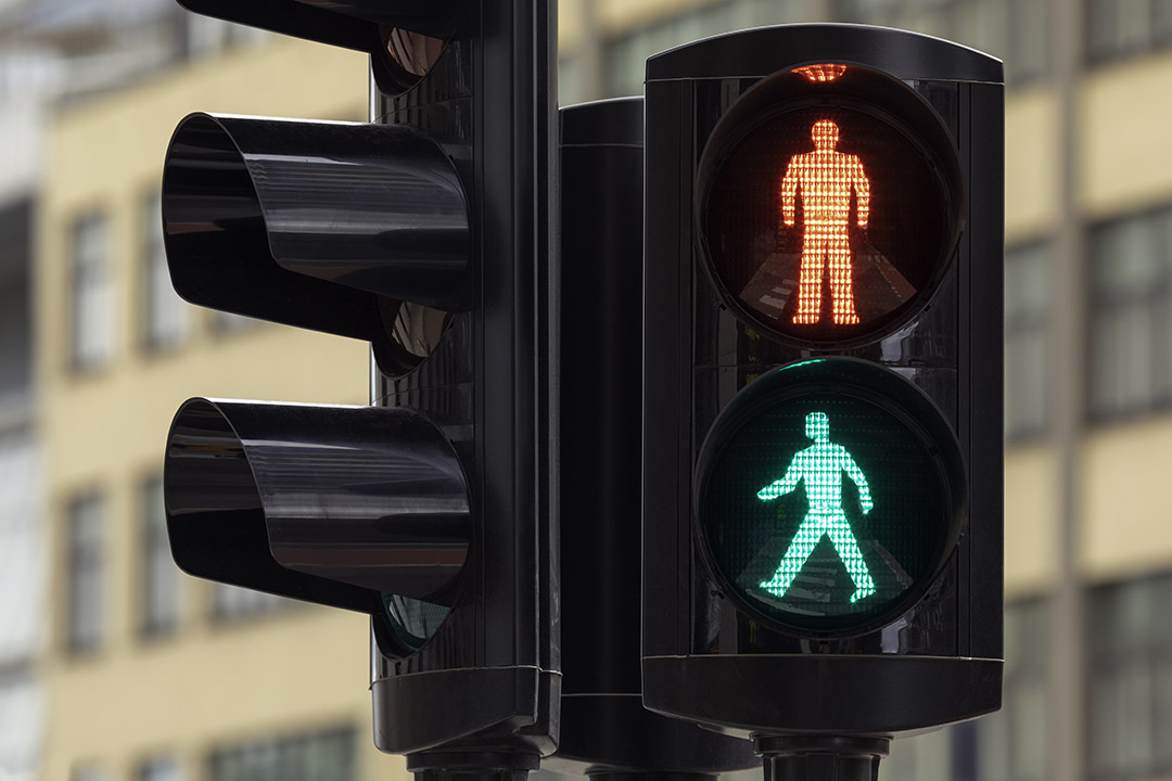
The colors have their own and important language. How do we know a tomato or a banana is ripe? The colors tell us when the grain is ripe and ready for harvest, and when the cherries can be picked and pickled. The seasons have their own color that we recognize without having to look at the almanac. The colors are essential in the traffic picture. We stop at a red light and drive on a green, and red signs mean prohibition and blue means injunction. The cold water tap has a blue symbol and the hot water tap has a red one. Although the colors of the traffic lights actually contradict the meaning of the colors; red indicates activity, but we should stop – green indicates calm and rest, but we should drive, it would be life threatening to change this.
Each color has its own language that is important to know and that can be used consciously. However, research shows that the color shades are just as crucial to the impression as whether the color is red or blue. A red color mixed with blue gives a completely different impression than if it were mixed with yellow. It can also be dimmed using white or black. The colors also change character according to what background it has, and what colors it is combined with. In any case, it is interesting to know the meaning and influence of the colors.
Red
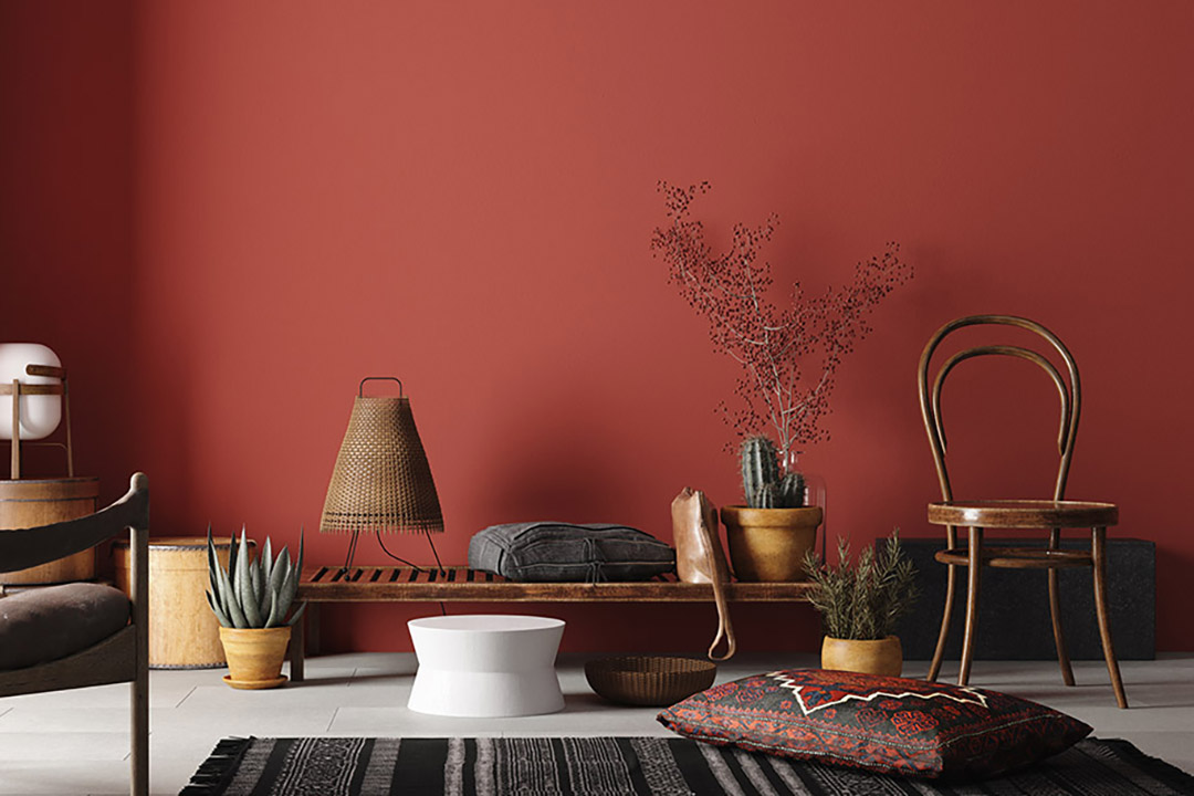
Red is an energetic and fiery color, which signals activity and drama, love and passion. It is the color of the blood, and our heart rate increases in red spaces. It is therefore claimed that it should not be used if you have high blood pressure or a bad heart. Red stimulates physical activity, and is not suitable for large areas in rooms to be used for rest and recreation. Red is one of the colors that the eye most easily detects. It is therefore used as a signal color – stop sign – fire extinguisher – Red Cross etc.
Yellow
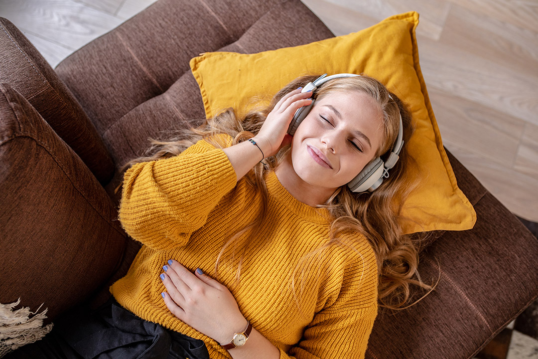
Yellow in the interior seems uplifting, but can also seem restless and annoying if it is a strong and strong yellow color. It has a double and contradictory symbolism. From the yellow color of the bile fluid which expresses envy and betrayal, to the warm color of the sun which expresses light and joy. It is said that yellow is the color of the intellect. If you are going to study for the exam, you should do so in yellow surroundings. It is claimed that yellow is not suitable for bedrooms, especially not for children, because it can lead to poor sleep.
Orange
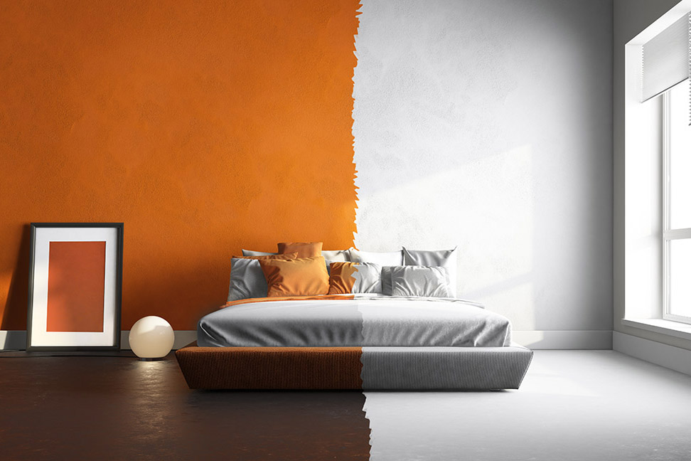
Orange in the interior gives warmth. It signals joy, movement and pleasure. Orange seems uplifting to many, and it chases sad thoughts to the door. Orange can be used where you want to stimulate activity and creativity.
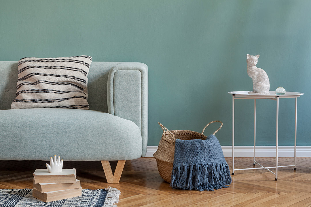
Green
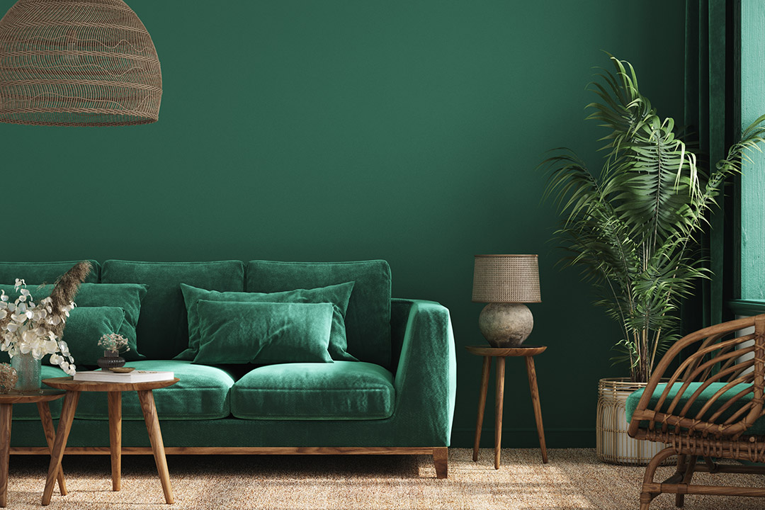
Green signals calm, balance and balance. It is nature’s own color and provides recreation and rest. It is ideal in rooms for conflict resolution. Green is a good and neutral color for the eyes and makes us stress down. It is not without reason that it is often used in treatment rooms and operating rooms. Green is a secondary color, and is mixed with yellow which is a warm color and blue which is a cold color. Green can therefore be both hot and cold.
Blue
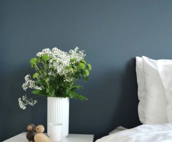
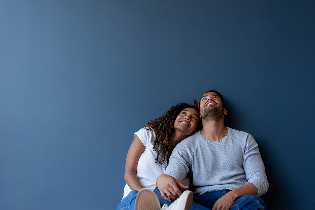
Blue belongs in the cold part of the color spectrum. Blue is the color of the sky, the sea and infinity. Room in blue gives a good feeling of space as opposed to red, which makes the room smaller. Before, blue was often chosen in the kitchen, because it is a cooling color and also seemed to keep the flies away. Blue is a good color in the bedroom, it has a relaxing effect and gives you good sleep. Blue is perceived as formal and conservative, and is also the global favorite color. If you are going to an interview, ask in blue if you want to be perceived as serious and proper.
Turquoise
Turquoise also belongs to the cold end of the color spectrum, it is even colder than blue. Turquoise is the hygiene color above some and is often used in swimming pools, showers and refrigerators. It is cool and refreshing and lets your mind go to exotic beaches and turquoise blue sea. Turquoise calms the nerves and strengthens the immune system. In the interior, we should be careful about using it on large surfaces, if we are not looking for the cool effect it gives.
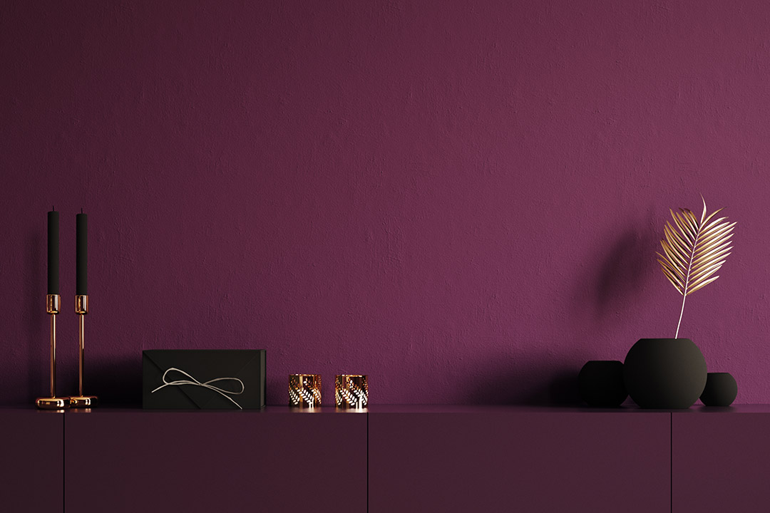
Violet
Violet is not so often used in interiors. It is a color that gives a feeling of reverence and dignity, luxury and mystery. In ancient times, violet was used by kings and equals, because it was an exclusive color. We often associate violet with artists and creativity and are the color of spirituality and spirituality. Violet is a complex and special color, so it is also a mixture of the warm and active red, and the cool and calm blue.
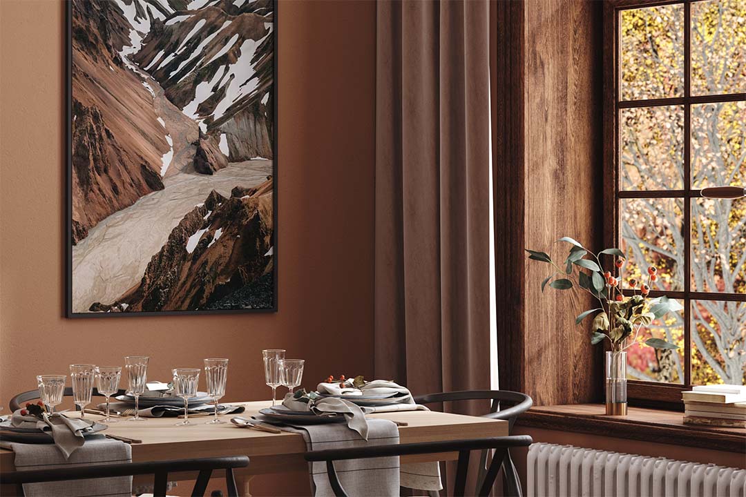
Beige and brown
Beige and brown are associated with earth tones and are often perceived as safe and stable, but also as unimaginative and dull. Beige and brown are also the wood’s color, and can here come into their own in the interior. How about a parquet floor in mahogany or oak? It’s neither boring nor unimaginative. Beige can be used on wall surfaces successfully and can be refreshed with the use of eg orange on the accessory.
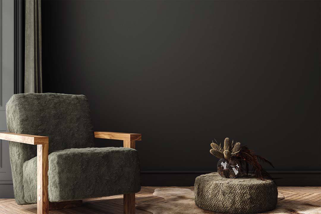
Black
Black together with red and white is the most symbolic of all colors. It is the color of sorrow and death. It absorbs all light and should be used with care in the interior. Used properly and in small doses, it can support other colors and create effect in the interior. It is also important to keep in mind that black comes in many varieties. A slightly milder variety with a matte finish can be very elegant. It is argued that black should be avoided where we eat because it has an adverse effect on appetite. In the fashion world, it has a completely different position. You are never wrongly dressed if you arrive at a company dressed in “the little black”. Black is the color of seriousness; a businessman with a serious message would have trouble in a large-flowered suit.